Operator Console

Year
2023
Company / Brand
Enghouse Systems
Role
Lead Designer, Design Direction
Sector
CX (Customer Experience), Enterprise SaaS
Operator Console is an application which seamlessly integrates with Microsoft Teams (previously with Skype) by providing advanced call-handling features for operators and client service departments. It is an application built to handle multiple incoming calls and help agents reroute them to an end destination.
This was an existing legacy application available as an on-premise Windows application. The goal of the project was to build a web application, while maintaining a visual correlation to the existing Windows-based application. The challenge was to handle this transition in smaller steps so as to not completely overwhelm the existing customer base with a dramatic change in the user interface and user flows.
As the Design Director on this project, I was in charge of overseeing the interface and usability design for the product. I led a team of 1 designer, and 2 developers to execute a UI redesign. I offered strategic direction for the layout and UX flows for primary tasks and oversaw the implementation to ensure it followed UI guidelines.
Approach
Conduct user interviews to better understand product requirements
Design new mock-ups for the web application
Scope out a long-term plan to evolve the UI & UX of the product.
Research and results
The first step was to understand the existing users. The UX team conducted interview sessions with existing users to better understand how product features can be improved, existing pain-points and prospective improvements which would enhance the usability of the product.
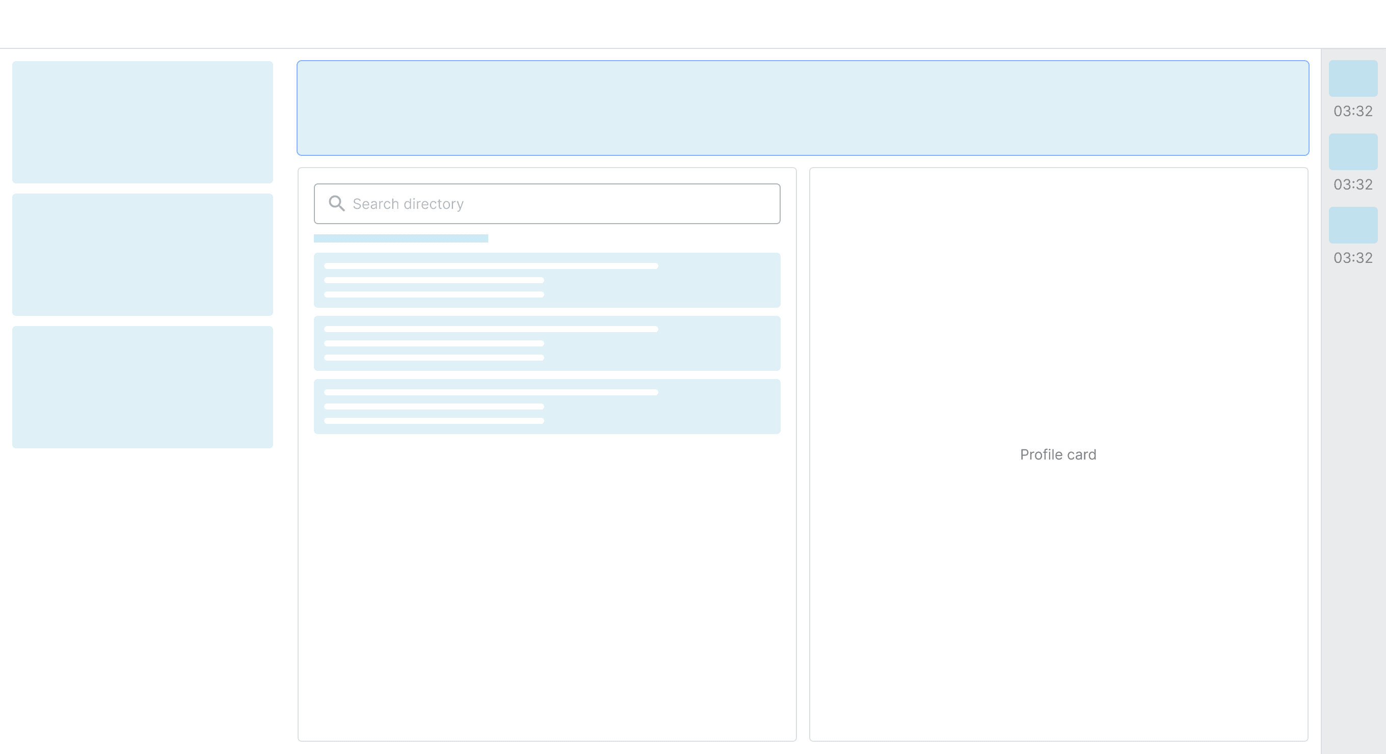
A better and powerful ‘Search’ feature.
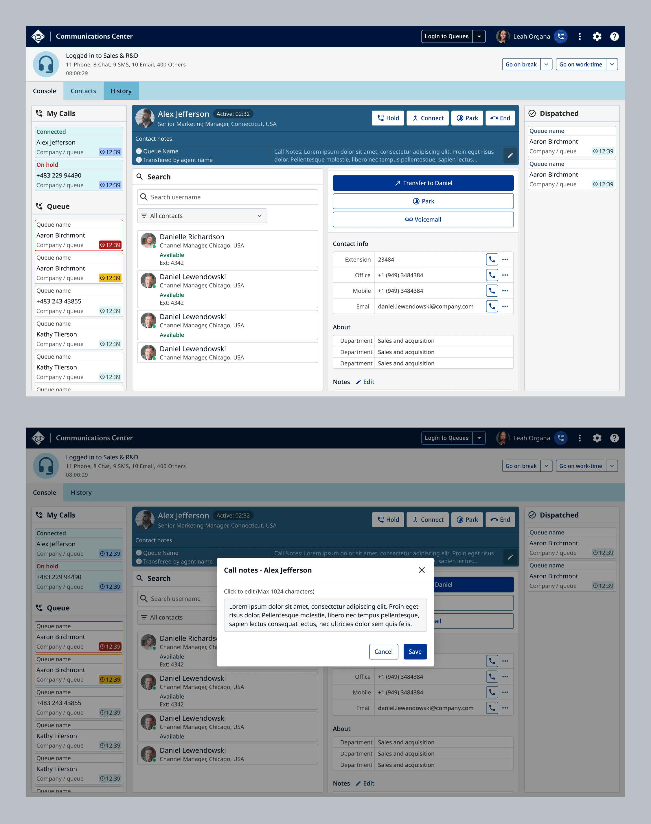
Ability to add notes for contacts for the next operator, or future reference.

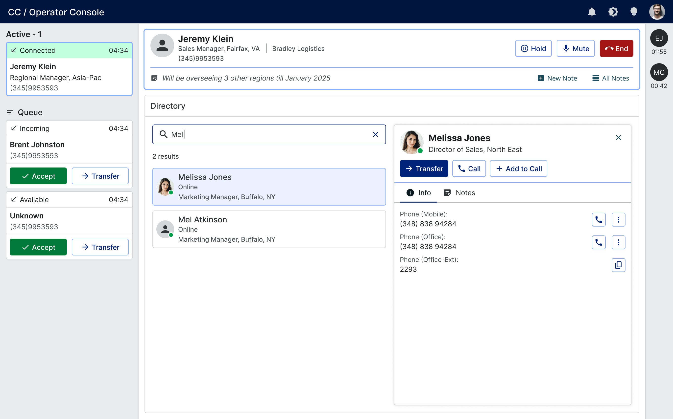
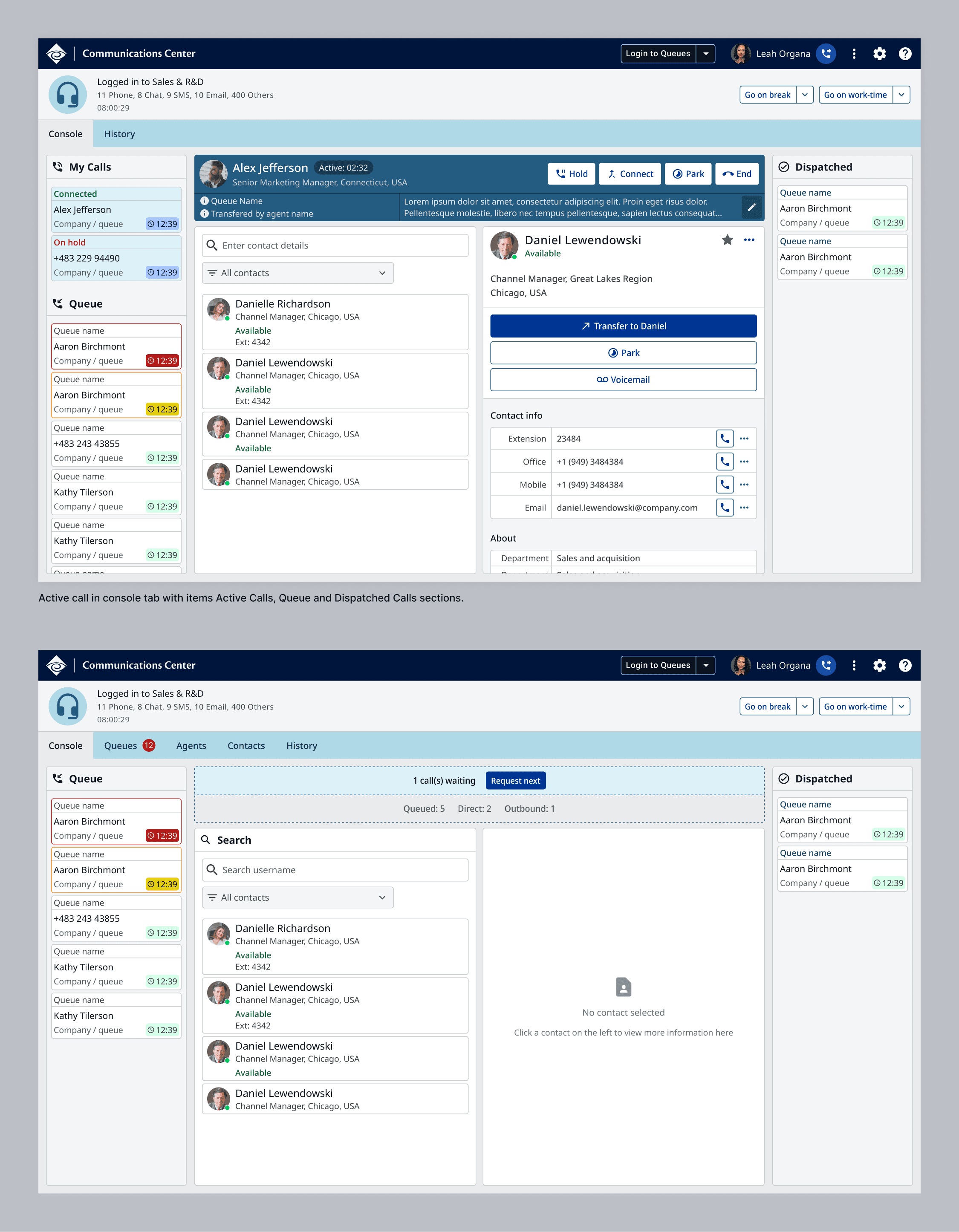
Phase 1
The plan for the first phase of the project was to maintain a familiar layout and flow to the existing Windows application. This meant, incoming calls on the left, call handing in the centre and dispatched calls on the right.
The colour codes to inform the Agent of a pending call were maintained, but only limited to the timer, so as the not overwhelm the user. We minimized unnecessary movement and animations as well, which were present in the original application.
On interaction toolbar, all the controls were presented on the interface without having to hover. All controls for the incoming call, and for the contact were displayed clearly so that the user can take an action without hovering or searching for them.
Phase 2 - Future improvements
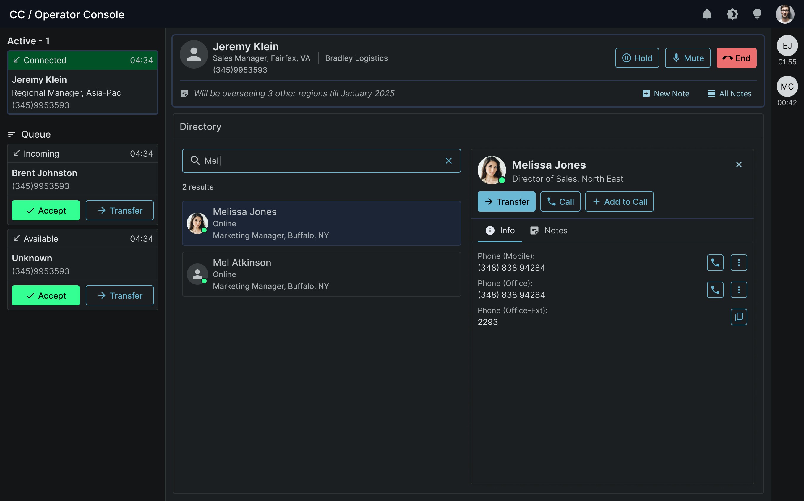
The future version of the product will implement the new Design System and UX guidelines. Using the new system will provide the options for light, dark and high-contrast modes. In terms of usability improvements, the Search feature will get a big upgrade by offering smarter keyword recognition.
The following screens are only concepts.